By Omar Noujoum
Deion Sanders, one of the greatest to ever play football, said, “you look good, you feel good. You feel good, you play good. You play good, they pay good.” Is that factual? Well, it worked for Deion, and since Phil Knight and Nike put their stamp on the University of Oregon’s football uniforms, it’s worked for them too.
Across the modern college football landscape, schools are competing to not only field the best team, but also field the team that looks the most fly. Many top-tier programs are closing the gap on the Ducks, unveiling fresh swag every Saturday. Still, Oregon reigns supreme. Here are my picks for their top five uniforms in program history…
#5: “Once a Duck, Always a Duck” (2016)
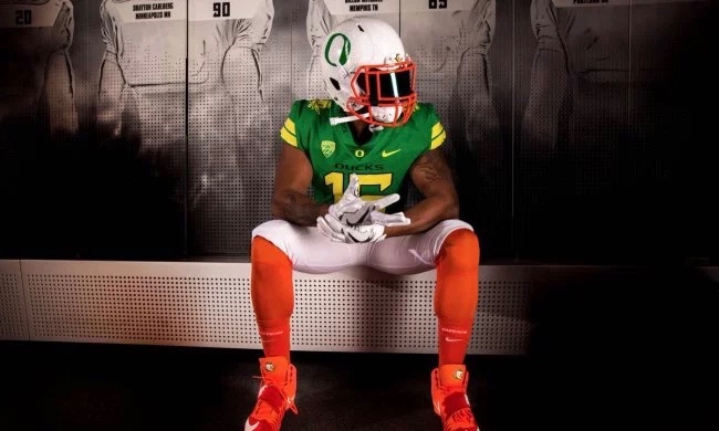
We start off with some love for the latest thread that the Ducks donned. The team wore these babies for the first time last week, and although they couldn’t get the win over Colorado, at least they lost in style. These uniforms mark the debut of orange on any Oregon Ducks’ uniform. The color scheme is set to match a real duck, or in this case, themascot (see below). These are a keeper.
#4: Steel Grate Sleeved Green & Black (2006)
As I became a college football fan and a Washington Huskies fan at age nine, I learned to hate the Ducks. But I couldn’t help but love their jerseys. Just seeing these uniforms brings me back to watching Dennis Dixon and Jonathan Stewart tear in up every Saturday. These threads are rugged, with a steel grate, manhole-like pattern on the shoulders, yet still stylish. A classic.
#3: Any Combination from Base Uniforms (2013)
It’s impossible to pick and choose when it comes to Oregon’s 2013 uniform set. The whole dam1`1n set is gorgeous. As much as the steel grate sleeve design was a winner, I still give the edge to winged sleeves (they are the Ducks after all). The first wing design that Oregon went to seemed odd and a little generic to me, but when 2013 came, that all changed. My personal favorite is they white jersey with reflective green wings (left).
#2: “Fighting Ducks” Alternates (2011)
When bright green and bright yellow are your team colors, you might as well go ahead and flaunt it. Be vibrant. That’s exactly what the team at Nike did for the Ducks with these beauties. It’s detailed, especially with the duck mascot on each shoulder, without losing it’s simplicity. I would almost buy this jersey right here, but that would be considered a crime for a Husky Fan. Regardless, the Oregon basketball team is still wearing these jerseys, but I’d like to see them back on the gridiron.
#1: “1994 Throwback Uniforms” (2014)
There’s something both stylish and elegant about modern remakes of throwback uniforms. The Ducks and Nike mastered that art in 2014 with these 20th anniversary remakes. From the past logos on the helmet and shoulders, to using the original tones of green and yellow, these uniforms keep a smooth, modern look while also taking fans back to 1994, when Oregon captured a Pac-10 title.


