


By Ben Shumate | Brown University
Wyoming folks know and love brown and gold like nothing else. If you grew up in the Cowboy State, as I did, you more than likely have some baby photos lying around like this one.

That’s me, no older than six months, already being indoctrinated as a Cowboys fan. Putting
aside the sophomoric jokes about the combinations of colors (we’ve heard them all before), it is
perhaps one of the more unique schemes in Division I athletics. It also makes for some
interesting uniforms, and Wyoming football has seemingly tried them all over the years.
THE CLASSICS

There’s something pure about old school football uniforms from the days when teams kept it
simple with one set for road games and one for homes games. The University was founded in
1892 and saw its teams in a variety of yellows until the 1980’s when the bolder yellow, which
simply became “gold” to fans, was adopted. Wyoming stuck with this look for a long time: brown,
gold, and the bucking horse logo on a white helmet.
I have to say, the pants on this combo are pretty bold. Those may be the thickest stripes in
college football history, and over gold pants no less.
THE DARK AGES
Where to start with these?

In 2000, University President Philip Dubois announced a rebranding of the athletic department
in an effort to raise more money through apparel sales. The University paid a consultant
$50,000 to conjure up… “prairie gold.”
Yep, prairie gold was the term they used. With a straight face.
Somehow beige or tan doesn’t excite, especially for a university trying to increase apparel sales.
Maybe it should be a rule-of-thumb that if you have to invent a name for a color to make it sound
more passable, it doesn’t belong in your uniforms. These things were, and still are, hideous.
Some fans refused to adopt the new shade in a rebellion of Dubois’ efforts, and any mention of
prairie gold today will still get some old-timers riled up.
Perhaps some forgiveness is deserved, as the first of Wyoming’s two bowl wins this century
came in prairie gold, when the Pokes beat UCLA at the 2004 Las Vegas Bowl.

THE CHRISTENSEN ERA
Fans rejoiced in 2007, when Athletic Director Tom Burman announced a return to the classic
gold color. By 2008, Wyoming hired Dave Christensen as head coach, after he turned Chase
Daniel into an elite quarterback as offensive coordinator at Missouri.
Christensen came in at a time when schools realized that high school kids actually cared about
cool uniforms, and that it could conceivably be a chip at the recruiting table (and a moneymaking
opportunity, of course). Oregon, with all its Nike connections, seemed to revolutionize
the college football uniform. Wyoming was never going to be Oregon, but they sure as hell were
going to try, with Christensen’s spread offense and dozens of new uniform combinations.

A lot of the new combinations were less popular with some fans (noticing a trend?), but this era
of uniforms was the most exciting for Wyoming football in my opinion. You could take solace in
knowing that the Cowboys wouldn’t be trotting out there in beige pants. Gameday gold was
safe, and yet the school was getting creative in how it combined the classic colors.
My personal favorite from this era? The alternate helmets, with the Wyoming state flag, easily
the most under appreciated state flag in the country, inside the bucking horse logo.

MILITARY APPRECIATION
I’ll preface this by saying that I tend to be largely against camouflage sports uniforms. Not
because I have anything against camouflage itself and certainly not because I’m against
showing support for our troops. Simply, schools and pro sports teams always find a way to put
their own bit of ugly into camo uniforms.
Case-in-point were these military appreciation uniforms the Cowboys unveiled for the 2012
season.

Now, these aren’t as bad as some camouflage uniforms out there, as the brown and gold camo is
reserved to the shoulders and pants. An interesting touch was that instead of players’ names on
the back, the name plates read things like “courage,” “honor,” or “duty.”
No, what tarnishes these jerseys is the irony of what happened the first time the team wore
them. The Cowboys hosted Air Force in Laramie for Military Appreciation Night on October 13,
2012. Wyoming blew a 10-point halftime lead, eventually losing 28-27.
After the game, Christensen launched into a profanity-laced tirade directed at Falcons head
coach Troy Calhoun as the two met on the field. Christensen believed Air Force had faked
injuries during the contest to earn stoppages of play. Among many other things, Christensen
called Calhoun a “flyboy,” and told him “I’d be scared to death if I had a f***er like you defending
me.”
Yikes.
The episode was caught on film, and Christensen was fined and suspended one game. He
would be fired after the 2013 season, the last year in which the camo uniforms were worn.
BACK TO BASICS
Every “football guy” cliché in the book applies to Craig Bohl, who took over as head coach of the
Cowboys in 2014. He’s a no-nonsense type, runs an old-school pro offense and has found
success recruiting guys to come to play in places like Fargo, North Dakota and Laramie. Bohl’s
style was on display when he announced that Wyoming would do away with the alternate
uniform combinations.
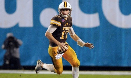
For the 2016 season, Nike unveiled these.

The uniforms are nothing flashy, and they are the only two the Pokes wore this past season. I
have to admit that it took me a while to warm to them. I am especially a fan of the white jersey
and the Western-style font used for numbers on both. Also of note is that the helmets are
exactly the same design as the 1980’s look. Add in the gold pants, and the current uniforms give
a pretty explicit nod to the old days.
Going forward, it might be fun to see the Pokes add at least one alternate option, perhaps a
gold jersey for a “gold-rush” home game. Or, dare I say, a prairie gold throwback?