


So Oregon basketball has unveiled their new “glow-in-the-dark” uniforms for tonight’s game against Utah. Safe to say, our writers have some…opinions on them.
Cody Goggin (@DaRealCG2)
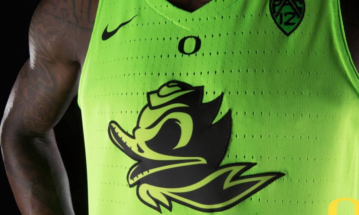
Glow-in-the-dark unis? Sure, sounds cool, right? Except for the logistics that basketball games are played in the bright lights of a gym.The glowing component of these uniforms is utterly useless when your court is already bright as hell in the middle and brown around the edges. The color mixtures on the floor are going to look like the inside of a frat house toilet the morning after a crazy party. Without the glow in the dark feature that childhood me would’ve loved, these unis just look like Dillon Brooks fell into radioactive waste. Impractical and ass ugly.
Liam Smith (@LiamSmith0)
These jerseys will be absolutely perfect for all the basketball games Oregon plays without the lights on! I get that Oregon is always trying to push the envelope with their exclusive Nike apparel, but this is where I draw the line. They look like professional lazer tag jerseys, or at the very best, something cool to wear to a rave. I don’t even want to know what these jerseys look like with the lights shining down on them, my best guess would be something like those heinous neon Baylor uniforms. I will say that I’m normally a huge fan of Oregon’s swag, but if you churn out a ridiculous amount jerseys every year like the Ducks, you are bound to have some clunkers. Side note, it must be frustrating to know that Oregon gets 2.5 million dollars worth of gear from Nike each year and still haven’t produced anything that even comes close to touching Gordon Bombay’s “Ducks” Jerseys.

Seth Berland (@sethjb417)
Well, this is about what we have to expect when it comes to the Oregon athletic department nowadays: flashy and bright (very, very bright). I have been a fan of most of their jerseys (mainly in football), but these new glow-in-the-dark basketball jerseys are a big miss for me. First off, they are just way too bright. I would get a headache just watching that game. Plus, its glow-in-the-dark… BUT THEY DON’T PLAY IN THE DARK (unless they have something new in mind). My second problem with it is that it looks like a mix between the Clippers alternate jersey and an Edward Scissorhands movie poster on the pants. But in an effort to not be too much of a negative Nancy, I will admit that I do kind of like the black and green socks and shoes that they have on. Much more subtle and much easier to look at. Overall, it’s exactly what I expect from Oregon whether I like it or not. Something tells me that this won’t even be the craziest Oregon jersey by the end of the year.
Frank Fanelli (@f_fanelli18)
Well I’m going to keep this short and sweet because simple there isn’t much to say about these hideous uniforms. My first reaction (like everyone else’s) was, “why are they wearing glow in the dark jerseys when they aren’t playing in the dark?” I mean seriously, what are they going to do? Shut the lights off in warm ups and warm up with the lights off and then in random parts of the game shut the lights off for 10 seconds so you can see these jerseys come to life? Like it’s already bad enough that these jerseys are ugly to look at, I mean they make me want to scratch my eyes out. But to the fact where you can’t even see the “glow in the dark” aspect of the uniform work unless the lights are off. I want to know if Nike and Oregon were thinking when making these jerseys because you can’t play basketball in the dark, you NEED to know where you are going. C’mon Oregon, I expected better, stick to football and football jerseys please and thank you.